Ugliest Baseball Uniforms steeped in tradition, boasts iconic team uniforms that have stood the test of time.
However, amidst the classics, some uniforms have courted controversy, sparking debates and even ridicule.
Here, we delve into the most contentious baseball uniforms that have left an enduring impact on the sport’s narrative.
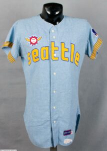
Seattle Pilots (1969)
The Seattle Pilots’ ephemeral presence in Major League Baseball is eclipsed by their infamous uniforms.
Sporting a peculiar amalgamation of a ship’s steering wheel with wings, their attire left onlookers perplexed.
The Pilots’ tenure in the league mirrored the brevity of their fashion statement, as they morphed into the Milwaukee Brewers after a solitary season.
Also Read: Ugliest mascot: How Oddity Became a Sports Staple
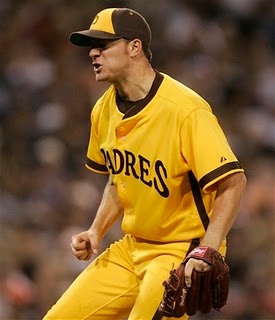
San Diego Padres (1972-1974)
In the early 1970s, the San Diego Padres opted for a daring departure with their uniforms, embracing a palette dominated by yellow and brown.
This audacious choice elicited mixed reactions, with many deriding the colors as an unflattering combination.
Despite the critique, these uniforms have garnered a cult following among certain fans, encapsulating the experimental ethos of the era.
While traditional baseball uniforms often evoke nostalgia and admiration, the Seattle Pilots and San Diego Padres chose to defy convention, leaving an indelible mark on the sport’s sartorial history.
These bold fashion statements, though controversial in their time, have since become emblematic of baseball’s willingness to push boundaries and embrace innovation.
As the sport continues to evolve, these iconic uniforms serve as reminders of baseball’s rich tapestry, where even the most unconventional designs find a place in its storied legacy.
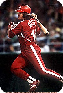
Philadelphia Phillies (1979)
In 1979, the Philadelphia Phillies embarked on a sartorial experiment by opting for all-burgundy uniforms during their Saturday games.
Departing from the conventional white and pinstripes, this monochromatic ensemble earned the moniker “Saturday Night Specials.”
Although the aim was to foster a sense of camaraderie and team spirit, the outcome was a uniform that garnered attention for all the wrong reasons.
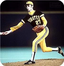
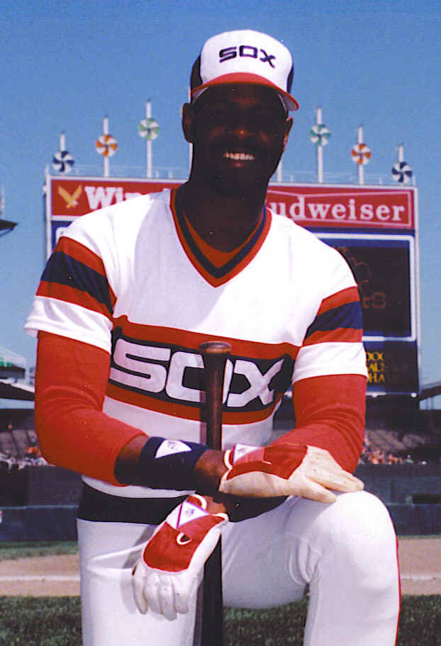
Chicago White Sox (1982-1986)
During the early 1980s, the Chicago White Sox introduced uniforms that diverged from the typical baseball attire, featuring a design more reminiscent of a racing team than a baseball squad.
Characterized by bold horizontal stripes and an unconventional font, these uniforms starkly contrasted with the traditional baseball aesthetic .
That resulted to Ugliest Baseball Uniforms.
They remain a subject of conversation among fans, serving as a testament to the era’s inclination to challenge norms and embrace innovation.
In essence,
baseball uniforms transcend mere apparel; they serve as reflections of their times and the teams they represent.
While not every design receives universal acclaim, each uniform narrates a unique story, enriching the intricate tapestry of baseball’s history.
Whether revered or criticized, these uniforms persist as compelling topics of discussion for fans and fashion aficionados alike.